Had a nice little talk a few days ago with Moonis Ijlal, a young artist who's done some fine book covers for Rupa and Picador. Indian publishers haven’t always given cover designs the attention they deserve (though this appears to be changing now) and when Moonis did his first cover, for Inez Baranay's Neem Dreams, no one was quite prepared for how seriously he would take the assignment. He read the book in its entirety (itself something not many designers do; most are content with a brief along by the author’s inputs, if any), then set about creating a collage by scanning neem leaves, nails and even cigarette butts.
 "One of the key elements of my design," he tells me, "was a milestone that simply had the number zero on it." When the author and the publisher asked him about it, he explained that it was his interpretation of the place where all journeys begin and end – a theme that’s alluded to in the book. "They were pleasantly surprised that I had actually put some thought into it!" he says.
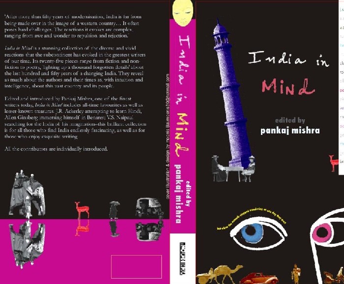
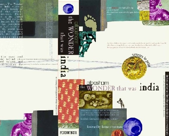
One of Moonis's preferred styles is the use of mixed media – the strategic placement of many small images at different points on the book cover. This is on view in his design for Rahul Bhattacharya's Pundits from Pakistan (the images include a bowler down on his knees and appealing, an overloaded truck and sundry photographs from Pakistan) as well as for Pankaj Mishra's India in Mind and the 50 anniversary edition of A L Basham's The Wonder that was India (it was serendipitous that he was asked to work on this edition, for the book is one of his all-time favourites).
 He also did the design for the Chetan Bhagat blockbuster Five Point Someone, with three cogs representing the principal characters (the three IIT loafers, including the narrator), a flower representing the young heroine and a single shoe her brother, a suicide. "Chetan never cared much for that stray shoe, he thought it was too oblique and pretentious" Moonis smiles, "but eventually I got my way."
He’s used to getting his way – when he works on a cover, he takes over the whole space, even deciding where and how the title should appear. His covers for Ramesh Menon's two-volume Mahabharata demonstrate this holistic treatment. Both covers feature small excerpts from the book's text, written in his own hand (this is another motif of his designs). "Since I read the whole book before preparing the design, I use little passages or sentences that I find particularly striking." On the cover of the first volume are featureless figures representing the Pandavas at the game of dice, the humiliated Draupadi, and Krishna standing in the foreground – identifiable mainly by his blue skin. The characters have short, cropped hair: "I wanted the contemporary look, because this is a great contemporary story," he explains.
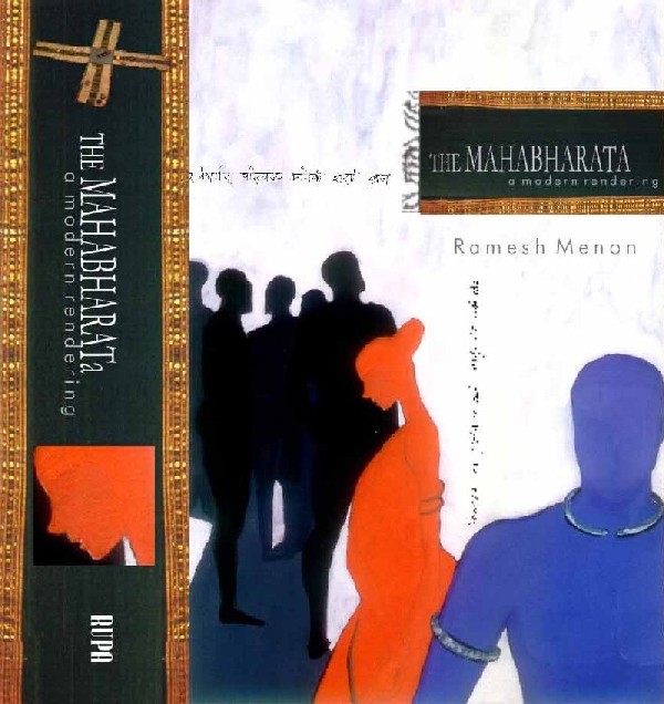
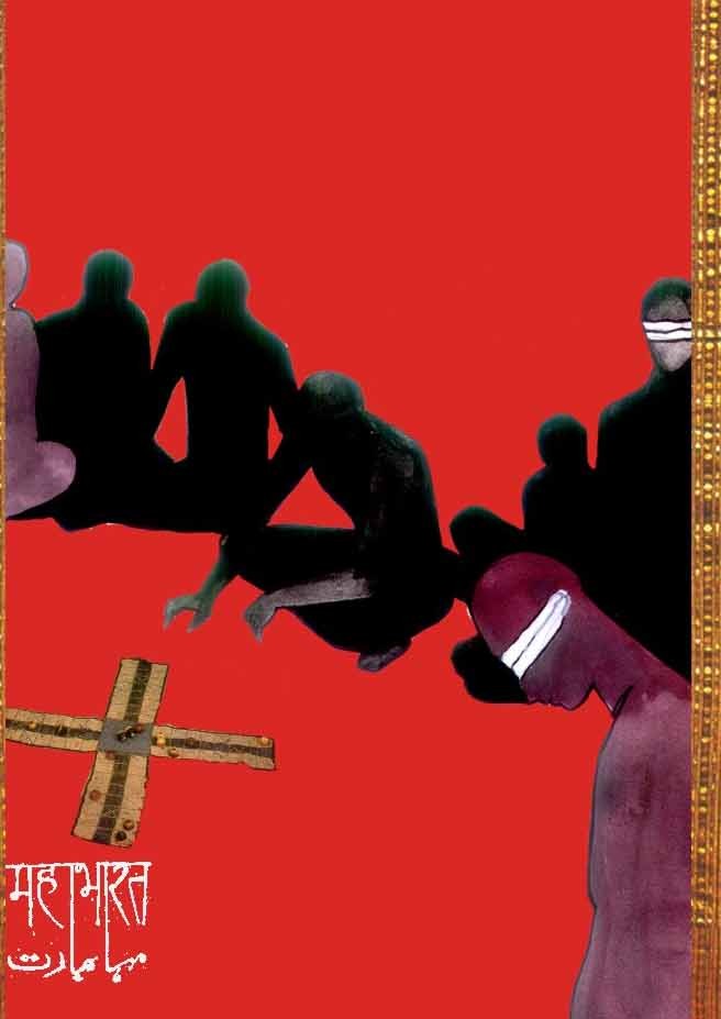
The second volume, which deals mainly with the terrible Kurukshetra war, has an aptly stygian look – a flock of ravens seen against a darkening sky – with just one bright spot, a white lotus that, he says, “represents the Bhagwad Gita, the sole light of hope in this dark tale". Another striking aspect of the design is the way the word "Mahabharata" is written on the back covers – in both the Hindi and the Urdu scripts, one word entwined with (and seeming to reach out to) the other. "The publishers weren't too sure about including the Urdu version," Moonis says, "but I pointed out that this is a universal story that belongs to everyone, not just to Hindus. It’s a great human tale that can unite people of completely different backgrounds."

Notwithstanding the care he puts into his designs, he’s quick to say that the most important thing is that the cover should be appealing. "I don't mind much if the casual reader doesn't notice all the little elements I've included in the design, or think too hard about their significance" he says, "as long as the overall effect is pleasing."
P.S. Incidentally, Bena Sareen, the group art director for Penguin Books India (one of the few publishers to have a full-fledged in-house design team), says the design lines between literary and genre fiction have become blurred. "Even highbrow literary works are being marketed as accessible," she says. It's no longer necessary for a work by, say Saul Bellow, to look more austere than a book by a genre writer. On that note, two stories from the Guardian about Penguin’s “designer books”, commissioned to celebrate the 60 anniversary of Penguin Classics. Five leading designers were asked to choose a favourite book from the backlist and to design it as they wanted. See what they did and what they have to say about it: Cover Versions and Cover Stories.
If memory serves me right, I've read some faaaaabulous pieces written by Moonis in the Indian Express. I thought he was a feature journo. Anyway, these designs are even more impressive!
ReplyDeleteI love the idea of the devnagari and nastaliq scripts reaching out and embracing one another! great designs!
ReplyDeleteShivam: yes, he was - he's with NDTV now. Haven't read any of his stuff but I have no problem believing he's a fine writer - he certainly is a very sensitive reader.
ReplyDelete'Orkut lover' is Ash, yes?
ReplyDeleteNikhil: stick to the blog topic on Comments! Yes, Orkut lover is Ash...though I suspect you would have responded to the questions quite similarly :)
ReplyDelete[1] Why Moonis Ijlal will never have a foot fetish:
ReplyDeletehttp://www.indianexpress.com/full_story.php?content_id=75723
[2] From the arteries of Old Delhi to the durbars of Mumbai’s Bohri Mohalla, we cruised the best addresses in the nation to break the Roza: http://www.indianexpress.com/res/web/pIe/full_story.php?content_id=80026&spf=true
Sad that he left for TV!
I found this post so interesting and wondered whether exactly the same books you mention can be bought in Europe.
ReplyDeleteI then read the Cover Stories link in the Guardian and it was wonderful to read the words of the designers themselves and the whys and wherefores of their designs.
Thanks, Jabberwock.
"Ash"?
ReplyDeleteawesome story!
ReplyDeleteFascinating!
ReplyDeleteAm assuming this is the same Moonis I knew at the Express. Funny I never got around to knowing this facet of the boy then despite the many cigarette breaks we had together.
ReplyDeleteHaven't been in touch with Moonis since leaving Express...
The book designs are pretty but I have to say from a branding perspective they suck. can hardly read the titles or the author.
ReplyDeleten!
Excellent Post - when are they coming out with a cheaper edition of the Mahabharata? Gotta read India in Mind too - man reading your blog makes me feel sick - I seem to be missing out on so much!!!
ReplyDeleteMonika, from Argentina.
ReplyDeleteI met Moonis in the Sanskriti Foundation long time ago. He is the best Book covers design I ever met, and he is the perfecto company for a trip to India.
i met moonis in delhi...i have seen his covers ...was so surprised to see his work and achievement at such young age ...wish the best in life to this young and talented guy.
ReplyDeletei'm from perú, south america, and i have to say moonis is also a beautiful human being. i'm glad his work is being recognized...
ReplyDeleteHi moonis so good to read about you and your covers.we know you are brilliant.I was just telling a friend about you.this is your friend naaz hare
ReplyDeleteI met moonis in Bhopal his nativ town..!!!
ReplyDeletea good artist and a good consultant regarding books..!!
I have known Moonis for a very looooooong time - over twenty five years. Despite the lack of conventional qualities needed to be a success - He is a success.
ReplyDeleteWell done my friend! You have made me proud.
Do you sometimes think about me?
well i have seen all these covers being made at home....by him :P
ReplyDeleteHave been his schoolmate. Have not been in touch for a long long time though. Just thought of looking out for him. Nice to see his work. Amazing!
ReplyDelete